Clay food project
The craftsmanship of some of these pieces are neat like the tomatoes and olives, but my original idea for pasta (twisted) didn't work out so I had to improvise by using a ridged rolling pin and twisting the pieces. The shapes generally aren't the neatest, especially in the bowl. The most difficult part of this was figuring out how to distribute my time. I spent a lot of time layering paint on and not enough time focusing on the shapes of the pieces in the salad. I feel like the color choices turned out harmoniously in the salad since I got the colors pretty close to what they actually are, but not the bowl, which is considerably darker and doesn't look quite right to me. This piece is interesting all around since the bowl is patterned the same way and the pieces inside move around. I tried to organize it so that there was a good balance between pasta and other things. 2D sketches are easier than making things in 3D since you can sketch out the shape. In 3D, I had to figure out how to make it with what materials and tools that make it look realistic. Since the sketch of tightly-wound rigatoni was really hard to recreate, I had to mess around and experiment with pasta textures. To create a more realistic cut food texture, I made the olives, tomatoes, and pepperoni as whole pieces and then cut them and I think it turned out well and looks like real food because I did that. What I would do differently if I re-did this is to spend more time planning and testing ways to make things before I come up with a solid plan.
Landscape in the style of the artist Romare Bearden
The artist I based this painting off is Romare Bearden. He used simple shapes with small bits of heavily textured images in collages. Colors were consistent between sections of the color (no gradient) and color in watercolor landscape paintings were muted with sketch lines visible beneath them. This painting was mostly well-executed with some parts improvised like the space between trees on the right and the color of the dirt in the foreground. The most difficult part of this was mixing the greens. My color choice is mainly consistent with a plain blue sky. Brighter greens represent where the sun hits and darker showing where it doesn't, the rest composed of browns like the example I used. I think the use of white and black in the bottom left throws off the balance/color scheme of the piece and next time I should stick with a color scheme throughout. This painting reflects the style of Bearden by keeping shapes simpler and adding texture, like in the clouds (which are paper attached and painted over with glue and blue paint) and the small bushes in the foreground (painted paper attached with glue). If Bearden saw it, he'd probably mention making art for a cause like how he did to bring attention to/highlight the lives of African-American people in his time period, so I want to make more in an art style that's more of my own to represent a cause like that. If I were to do this project again, I would make the colors more flat, add more collage aspects and realistic magazine cutouts like Bearden did in Charlotte, 1911, and represent something that people don't really think about like he did at the time to raise awareness.
Artist- Romare Bearden
Copy Artist's Painting
Value - Acrylic
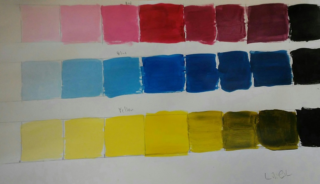
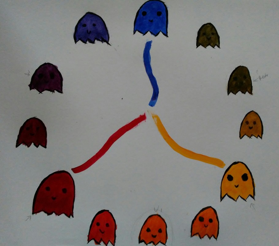
Color Wheel - Acrylic
Close-up with Prismacolors
My piece is neat and ordered well, however, I didn't use very many values. I captured depth with lines and shading like in the silver thread part of my final. I represented the style of Georgia O'Keeffe by making the composition of my piece very up-close and focusing on individual shapes. I used brown, beige, and yellow to give the mask the variety of colors it has in the picture as well as gold and silver colored pencils which were used on the nose, forehead, and thread of the mask. The light colors lay next to the dark ones to create contrast. Shadows help show the bends in the thread and the lineish shading in the bottom of the mask helps give it a brushed effect. Highlights, like on the left side of the mask, help give depth. I had difficulty blending and deciding what colors to use since I didn't consider adding colors that weren't originally a part of the mask. To improve this I can think about that more.
Pastel
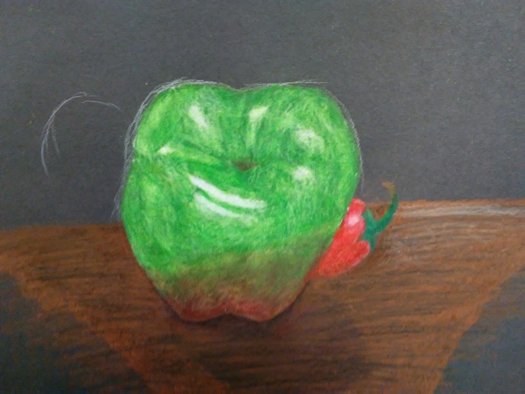
Prismacolor Fruit
No in progress pictures, sorry.
Prismacolor Spheres
Watercolor Apples
Watercolor Techniques
I was absent when we did the watercolor value charts and shapes.
Pen and Ink Value and Perspective Project
I began with stippling for the floor to have it seem more like a short carpet and added cross-hatching to define the walls and hatching to define the stairs. I used the inventive technique on the poster on the back of a chair and the sky and clouds outside to add variance and definition to them. I used the perspective of a person in the room. It’s important because with perspective it’s like you’re experiencing the picture and aren’t just looking at it. Texture is important because it shows the difference between materials and objects, like the chair vs the wall or the floor, or the stairs vs the floor. Value is important in this project because it shows where the light hits the objects and makes them look realistic. My project is crafted well with the composition and viewpoint because the objects are sized realistically compared to each other and go along with the point of perspective consistently. If I could recreate this piece I would focus more on composition and spend more time on setting it up and deciding what techniques would go where and what values to use because the spiral staircase doesn’t look very good at all (most of the top half was improvised- where the pattern switched to a mix between cross-hatching and inventive) and the chairs and table aren’t very neat/distinguishable from each other. The walls have little to no difference in value and more would have made the piece more realistic. It’s important to make sure you understand the pen and ink concepts taught in class (ex. Even spacing between dots, lines, etc) to make your piece look neater and more well-done. I’ve learned that putting focused time into each individual part of a piece will make the outcome a lot more desirable.
I began with stippling for the floor to have it seem more like a short carpet and added cross-hatching to define the walls and hatching to define the stairs. I used the inventive technique on the poster on the back of a chair and the sky and clouds outside to add variance and definition to them. I used the perspective of a person in the room. It’s important because with perspective it’s like you’re experiencing the picture and aren’t just looking at it. Texture is important because it shows the difference between materials and objects, like the chair vs the wall or the floor, or the stairs vs the floor. Value is important in this project because it shows where the light hits the objects and makes them look realistic. My project is crafted well with the composition and viewpoint because the objects are sized realistically compared to each other and go along with the point of perspective consistently. If I could recreate this piece I would focus more on composition and spend more time on setting it up and deciding what techniques would go where and what values to use because the spiral staircase doesn’t look very good at all (most of the top half was improvised- where the pattern switched to a mix between cross-hatching and inventive) and the chairs and table aren’t very neat/distinguishable from each other. The walls have little to no difference in value and more would have made the piece more realistic. It’s important to make sure you understand the pen and ink concepts taught in class (ex. Even spacing between dots, lines, etc) to make your piece look neater and more well-done. I’ve learned that putting focused time into each individual part of a piece will make the outcome a lot more desirable.
I began with stippling for the floor to have it seem more like a short carpet and added cross-hatching to define the walls and hatching to define the stairs. I used the inventive technique on the poster on the back of a chair and the sky and clouds outside to add variance and definition to them. I used the perspective of a person in the room. It’s important because with perspective it’s like you’re experiencing the picture and aren’t just looking at it. Texture is important because it shows the difference between materials and objects, like the chair vs the wall or the floor, or the stairs vs the floor. Value is important in this project because it shows where the light hits the objects and makes them look realistic. My project is crafted well with the composition and viewpoint because the objects are sized realistically compared to each other and go along with the point of perspective consistently. If I could recreate this piece I would focus more on composition and spend more time on setting it up and deciding what techniques would go where and what values to use because the spiral staircase doesn’t look very good at all (most of the top half was improvised- where the pattern switched to a mix between cross-hatching and inventive) and the chairs and table aren’t very neat/distinguishable from each other. The walls have little to no difference in value and more would have made the piece more realistic. It’s important to make sure you understand the pen and ink concepts taught in class (ex. Even spacing between dots, lines, etc) to make your piece look neater and more well-done. I’ve learned that putting focused time into each individual part of a piece will make the outcome a lot more desirable.
Pen and Ink Value Charts and Techniques
Perspective
Pencil Still Life with Value Project
I arranged this piece to be balanced in the area between the bottles, fabric, and background. I used value to define the edges and shape of the objects that are done. I used a wide range of values, usually beginning with black on the left and gradually moving to white across bottles. Practicing angling my shading to follow the curve of the bottles, controlling the pressure I put on my pencil, and determining what softness of lead to use improved the value and overall appearance of my piece by helping me define the gradients of color and the edges of bottles. I interpreted the texture of the glass of the bottle as shiny and smooth while the texture of the labels and fabric are more flat and matte. The work captures that by showing streaks of light reflected in the glass being muted by the labels on the bottles. If I could recreate this piece I’d spend more time on shading to make the glass look smoother and the labels clearer, with the text on the labels that’s meant to be there. I’d spend more time on the background and the metal handle of the brewery bottle on the left, but I’d focus the most on the fabric. I’m not sure how to shade white objects like the fabric or how to show the movement of it. I’d spend more time practicing values on different materials and shapes to improve that.
